
Death by bullet points - How to be read in a digital world?
 Simon Mercier
 Ludovic Faucon
- 5 Min To Read
- 14 Jan, 2025
Have you ever questioned the use of bullet points in your presentations?
PowerPoint (or other software) displays them by default, so we have become accustomed to seeing them everywhere without questioning their value for the readability of what we want to present.
In this article, we will present a series of small design tips, easy to implement, to replace our bullet points and enhance both readability and aesthetics.
Let’s kill the bullets
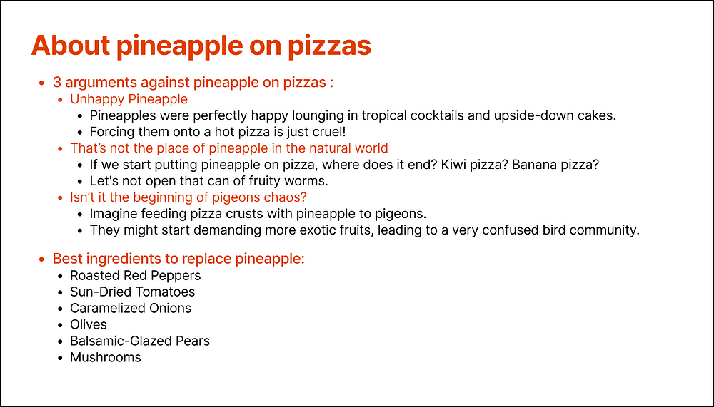
Here is the slide that we will improve throughout this article:
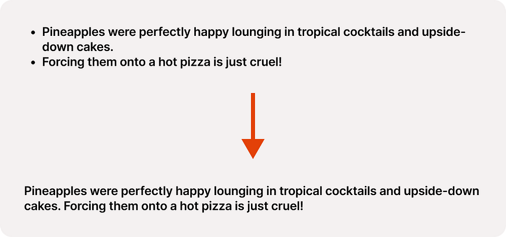
New sentence ≠ Bullet points
Bullet points should be reserved for enumerating coherent elements. The list of ingredients at the bottom of the slide is a good example.
In contrast, a paragraph should not be interrupted by bullet points simply to introduce a new sentence.
Removing first-level bullets
It rarely makes sense to have first-level bullet points because a list of coherent elements only makes sense if it is preceded by an introductory sentence.
For example, here, bullet points are used wisely but are inseparable from the introductory sentence:
My favorite fruits are:
• Apples
• Pears
• Pineapples
We can therefore transform our lists by following this principle:

By applying these first two principles, we already got rid of most unnecessary bullet points:
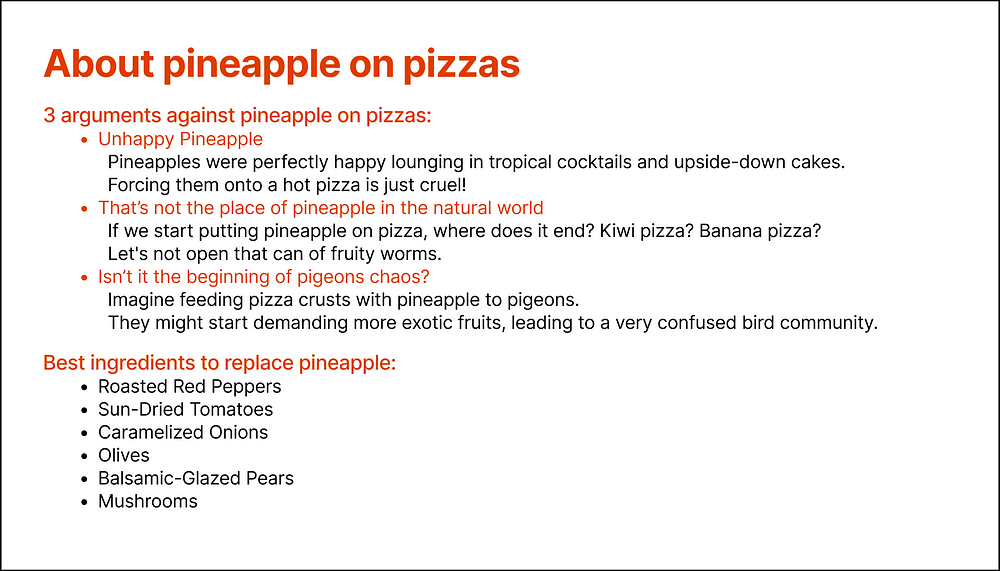
It should be noted that this has eliminated the cascading layout of the bullets, which improves the reading and legibility of the list.
Spaces or bullets?
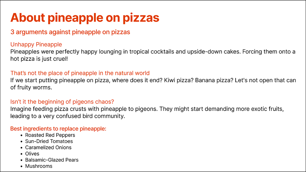
Sometimes, bullet points are used to separate blocks of information. However, if the information to be presented does not form a proper list, spacing the paragraphs is often a more elegant and clearer solution than using bullet points:

Bravo, we have managed to eliminate all unnecessary bullet points!
The result is far from perfect, but we now have a solid foundation that will allow us to achieve a truly satisfying outcome.
Title scanning
We read a book linearly, starting from the first word of the first page to the last word of the last page. This is not at all how we consume digital content. On the contrary, we scan the content without really reading it, searching for the information we need. Initially, we read the titles. Only if a title convinces us will we read the content of the corresponding paragraph. So here’s what a viewer will immediately see in our example:
These titles are not pleasant to read for two main reasons:
- They do not flow as a coherent sequence of phrases.
- The beginnings of the phrases are not uniform.
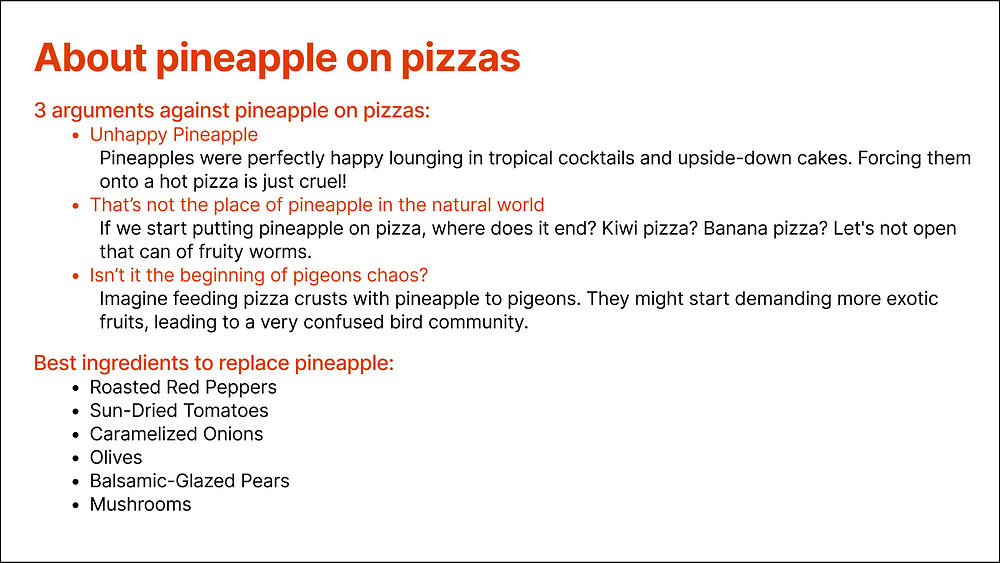
Let’s consider the first part of our example (forgive us for the temporary return of bullet points):
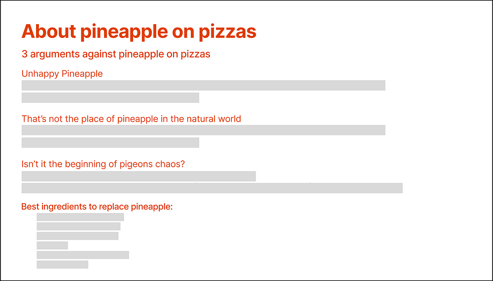
3 arguments against pineapple on pizzas:
• Unhappy Pineapple
• That’s not the place of pineapple in the natural world
• Isn’t it the beginning of pigeons chaos?
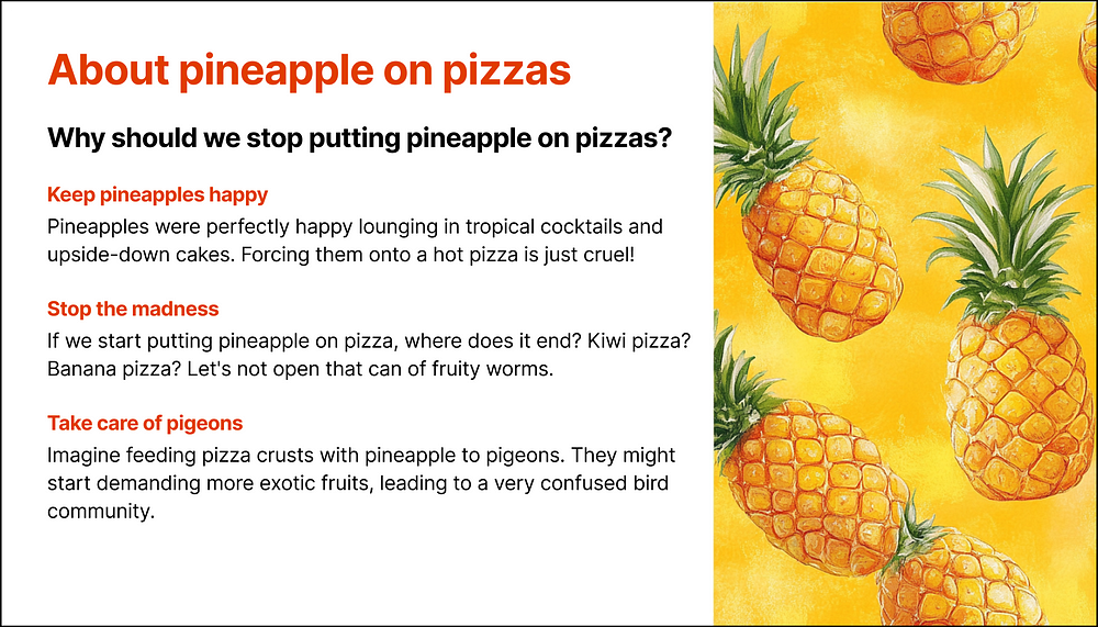
We could rephrase these titles as follows:
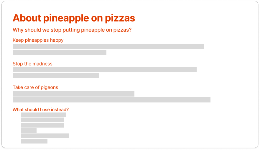
Why should we stop putting pineapple on pizzas?
• Keep pineapples happy
• Stop the madness
• Take care of pigeons
In this second example, all three section titles are of similar length and start with a verb. This meets the criterion of uniformity. Moreover, the whole reads like a conversation, contributing to the flow of reading.
Hierarchy
A good hierarchy between elements can make a huge difference between mediocre and good design.
The main tools for text hierarchy are:
- Size
- Weight
- Color
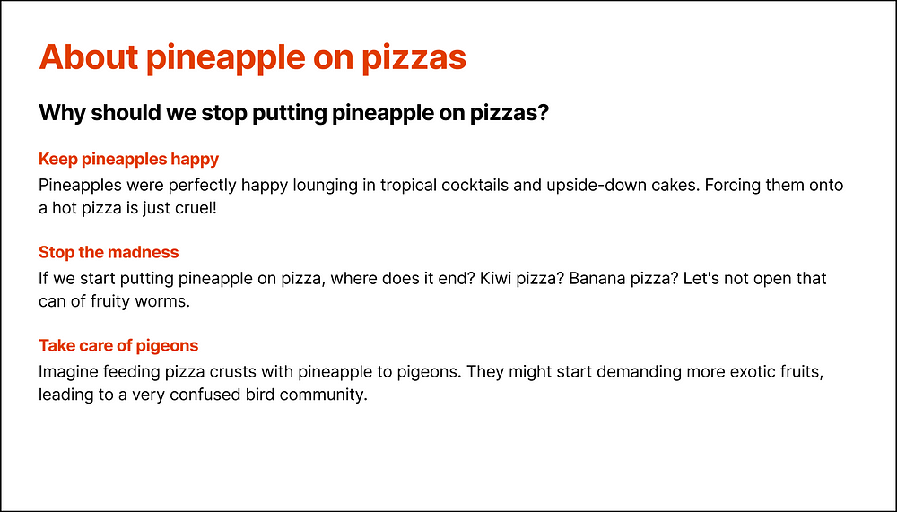
In our example, we are using these three elements. But in a way that is too timid for it to work. Let’s try to emphasize the hierarchy among our titles:
We have:
- Increased the size and weight of the subtitle and changed its color to black to make it stand out.
- Increased the weight of the section titles to clearly differentiate them from the content.
- Adjusted vertical spacings for better readability.
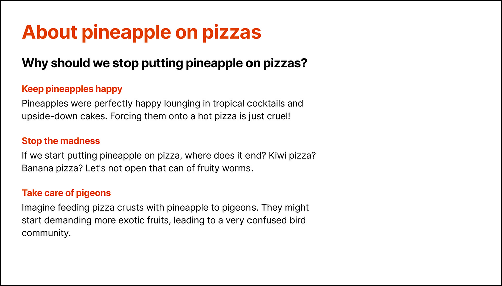
With a good hierarchy, the result looks much more professional.
As we have increased the size of certain fonts and adjusted certain spacings to improve the hierarchy of our elements, the list of ingredients no longer fits on our slide.
That’s okay! We will see later if we manage to add it, or we will create a second slide. Better to have two slides that our viewers will read than one that won’t be read.
Line size
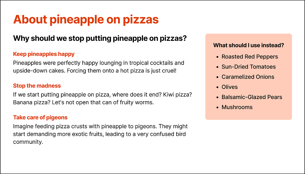
Lines that are too long are uncomfortable to read, forcing our eyes to make long back-and-forth movements to read the text. Articles, like the one you are reading now, are a good example: the text is never edge to edge if you are reading on a large screen.
That’s why it’s better to avoid having text occupying the entire available width, even on a slide:
If the empty space bothers you, there are several solutions:
Add an illustration:
Or include content in another form, like our list of ingredients for example!
Conclusion
We have come a long way since our first version!
Yet, we have only applied simple principles that do not require specific design or graphic skills.
If you want to work further on your slide, you can add some illustrations, icons, or emojis:
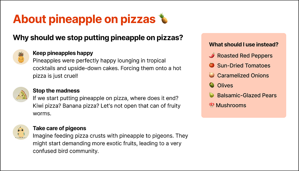
Here, we have:
- Replaced the colored titles with black titles accompanied by colorful illustrations.
- Replaced the last bullet points with emojis. This time, we have really eliminated all of them!
- Added a pineapple next to the title (because it looks nice).
We hope to have convinced you to join us in the hunt for unnecessary bullet points!
To be continued…
This article is the first in our series “How to be read in a digital world?”.
In this series, we will try to simplify design and UX writing principles to help as many people as possible write content that will be read, whether on slides, web and mobile applications, or any other digital medium.