
D3 for beginners
 Valery Brasseur
- 10 Min To Read
- 02 Apr, 2024
Ever wanted some beautiful graphs on your application ? D3.js is a library for doing just that: rendering beautiful graphs using HTML and SVG.
What is D3.js
D3.js is a free, open-source JavaScript library used for visualizing data.
It provides unparalleled flexibility for creating dynamic, data-driven graphics on the web.
D3 has been influential in revolutionizing data visualizations, powering groundbreaking projects, and becoming a foundation for other chart libraries.
It was created in 2011 by Mike Bostock, co-authored by Jeff Heer and Vadim Ogievetsky at Stanford.
Over the years, numerous contributors have helped maintain and improve D3, making it a cornerstone in the field of data visualization.
The D3 in D3.js stands for “Data-Driven Documents.”
D3.js allows developers to bind data to DOM (Document Object Model) elements and apply data-driven transformations to the document.
It provides a powerful set of tools for working with data and creating interactive and dynamic visualizations.
D3.js is often used for creating charts, graphs, maps, and other types of data visualizations on web pages.
In this article, we’ll see how to get started with D3.js and make your first plot.
Your first plot
D3 is a low-level toolbox, it is not a charting library in the traditional sense. It has no concept of “charts”. When you visualize data with D3, you will have to compose with a variety of primitives.
To make a chart, you might use:
- a CSV parser to load data,
- a time scale for horizontal position (x),
- a linear scale for vertical position (y),
- a scale and categorical scheme for color,
- a layout for arranging values,
- an area shape with a linear curve for generating SVG path data,
- axis for documenting the position encoding, and selections for creating SVG elements.
Let’s take a deep-dive into creating a simple chart and render it in a simple HTML page.
Note: this tutorial as been written for D3.js v7. This version has undergone significant API changes, so be cautious when applying the following code on older versions (like v3 or v4).
Drawing as on paper
For this introduction, we will use a basic HTML page, where we will draw our graph. Of course, all usual styling and coding can be applied to it if needed.
<!DOCTYPE html>
<html lang="en">
  <head>
    <title>Simple D3.js tutorial</title>

    <!-- D3 using -->
    <script src="https://d3js.org/d3.v7.min.js"></script>
    <script src="https://d3js.org/d3-timer.v1.min.js"></script>
    <script src="https://cdnjs.cloudflare.com/ajax/libs/topojson/1.6.19/topojson.min.js"></script>
  </head>

  <body>
    <header id="header">
      <h1>Simple D3 tutorial</h1>
    </header>
    <main id="main">
      <div id="chart" class="graph"></div>
    </main>
    <script>
      const container = document.getElementById("chart");
      const width = 800; // container.clientWidth;
      const height = 400; // container.clientHeight;

      /* create a SVG container */
      const svg = d3
        .select(container)
        .append("svg")
        .attr("width", width)
        .attr("height", height)
        .append("g") // create a group in it
        .attr("transform", "translate(50,50)"); // Adjust margins as needed
    </script>
  </body>
</html>
The code above creates a SVG container where D3 will be able to work. For now, it’s a blank canvas.
The data
We’re now going to draw a curve on our graph. To do that, of course you need data: data is the fuel of D3! In this beginner guide, we will use a local CSV file to demonstrate how to load data.
// load a CSV
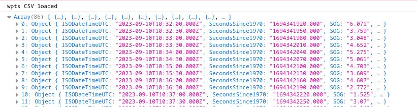
d3.csv("sog.csv").then(function (sog_data) {
console.log("wpts CSV loaded");
console.log(sog_data);
});
By default D3.js will make an array of objects from our CVS data with all values encoded as strings:
But you can customize the type conversion during loading as the function d3.csv can take another parameter:
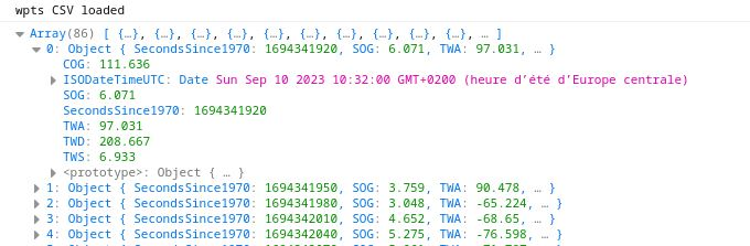
d3.csv("sog.csv", typeconv).then(function (sog_data) {
  console.log("wpts CSV loaded");
  console.log(sog_data);
});

// CSV type conversion Helper function
function typeconv(d) {
  const parseTime = d3.timeParse("%Y-%m-%dT%H:%M:%S.000Z");
  return {
    ISODateTimeUTC: parseTime(d["ISODateTimeUTC"]),
    SecondsSince1970: +d["SecondsSince1970"],
    SOG: +d["SOG"],
    TWA: +d["TWA"],
    TWS: +d["TWS"],
    TWD: +d["TWD"],
    COG: +d["COG"],
  };
}
Now, our data have better types and will be easier to handle for performing calculations and transformations:
Scales
Now you have your paper and data, you need to apply some scales on it. The idea of scaling is to take the range of values of data (input) and make it fit in the space available (output). In our example data, we will graph some speed versus time, so we will need two scales:
- a time scale
- a speed scale.
A D3 scale function has a domain and a range. The domain specifies the input extent (for example [0, 100]) and the range defines the output extent (for example [0, 1000]) of the scale, that is the area available to render your graph.
Note: D3 has around 12 different scale types (scaleLinear, scalePow, scaleQuantise, scaleOrdinal, etc.) and, broadly speaking, they can be classified into 3 groups:
- scales with continuous input and continuous output
- scales with continuous input and discrete output
- scales with discrete input and discrete output
In our case, we can use some D3.js functions to help find those ranges:
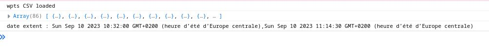
/* find min/max date */
minMaxDates = d3.extent(sog_data, d =>  d.ISODateTimeUTC);
console.log("date extent : " + minMaxDates);
and create our scales :
// Set up scales for x and y axis
const xScale = d3.scaleTime().domain(minMaxDates).nice().range([0, 800]);

// normally our speed are positiv !
const yScale = d3
  .scaleLinear()
  .domain([ 0, d3.max(sog_data, d => d.SOG) ])
  .nice()
  .range([400, 0]);
If the domain has been computed automatically from real data (e.g.
by using d3.extent) the start and end values might not be round figures.
This isn’t necessarily a problem, but if using the scale to define an axis, it can look a bit untidy, that’s why we use the nice() method that will round the domain to ’nice’ rounded values!
Axis
You now have a paper, some scales, let’s draw some axis with all these.
For that, D3.js has some helpers which can generate the drawing code to layout nice looking axis:
- axisTop : An axis with values and ticks drawn above a horizontal axis.
- axisRight: An axis with values and ticks drawn to the right of a vertical axis.
- axisBottom: An axis with values and ticks drawn below a horizontal axis.
- axisLeft: An axis with values and ticks drawn to the left of a vertical axis.
// axis generator
const xAxis = d3.axisBottom(xScale).tickFormat(d3.timeFormat("%H:%M:%S"));
const yAxis = d3.axisLeft(yScale);

// append axis to container
svg
  .append("g")
  .attr("class", "x-axis")
  .attr("transform", "translate(0, 300)") // Adjust the y-position of the x-axis as needed
  .call(xAxis);

svg.append("g").attr("class", "y-axis").call(yAxis);
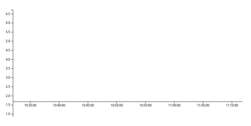
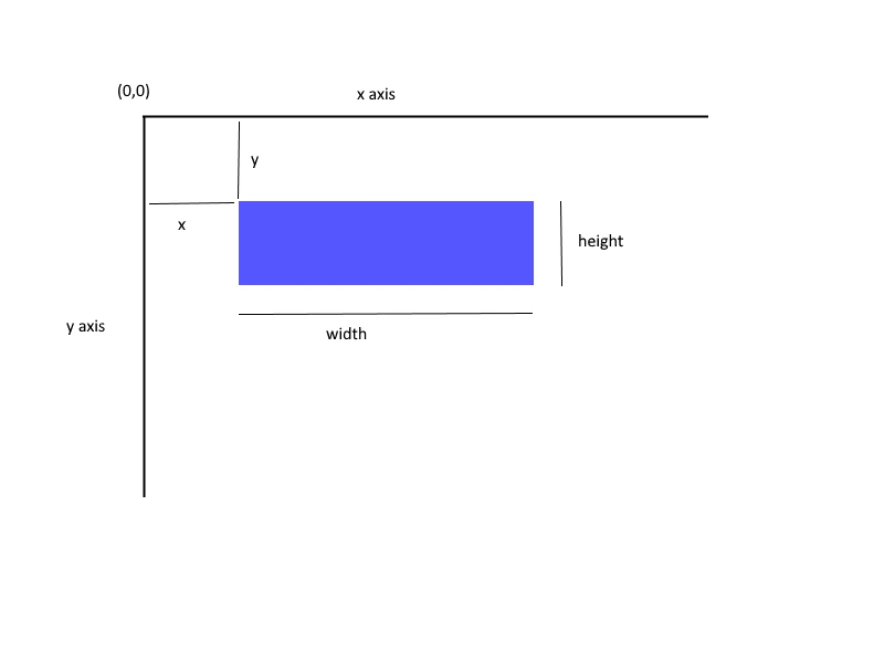
Note that SVG defines the origin, the point with coordinates (0, 0), at the top left corner of the viewport.
The positive x-axis pointing towards the right, the positive y-axis pointing down
The data curve
It’s time to draw our data! We have all the elements, just missing our curve.
// finally: append our data curve
const line = svg
  .append("g")
  .append("path")
  .datum(sog_data)
  .attr(
    "d",
    d3
      .line()
      .x(d => xScale(d.ISODateTimeUTC))
      .y(d => yScale(d.SOG))
  )
  .attr("stroke", "steelblue")
  .style("stroke-width", 1.5)
  .style("fill", "none");
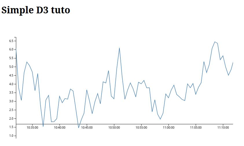
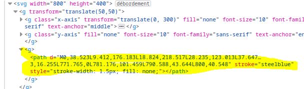
In the DOM structure, we can see that all the elements we have defined are attached to our SVG tree.
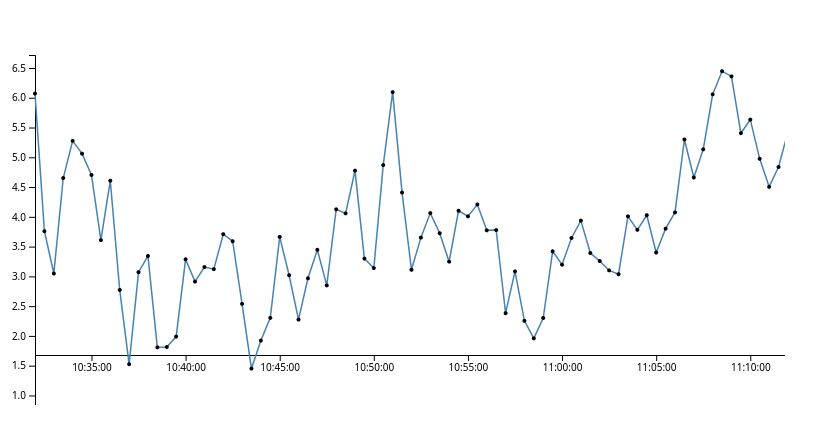
Making joins
Join is a powerful tool of D3. Usually, when we want to transform lots of data, we would probably write something like a foreach loop.
But D3 as something more powerful. Instead of telling D3 how to do something, tell D3 what you want.
For example: let’s say we want to draw a circle around each of our data points ? Instead of creating a loop, and draw circle around each, we can tell D3 that our selection data should correspond to the circle. In D3, this concept is called the data join.

Data points joined to existing elements produce the update (inner) selection. Leftover unbound data produce the enter selection (left), which represents missing elements. Likewise, any remaining unbound elements produce the exit selection (right), which represents elements to be removed. Using joins means declaring a relationship between a selection (such as “circle”) and data, and then implementing this relationship through the three enter, update and exit states.
Here, if we would like to add a point around each value, using some D3.js selection it’s relatively easy :
svg
  .selectAll("point")
  .data(sog_data)
  .enter()
  .append("circle")
  .attr("class", "point")
  .attr("r", 2)
  .attr("cx", d => xScale(d.ISODateTimeUTC));
  .attr("cy", d => yScale(d.SOG));
and this is how it looks:
data vs datum. data takes the specified array and joins it to a selection of data. Joining data allows for dynamic updating of the data via ‘update’, ‘enter’ and ‘exit’ selections. datum doesn’t join data to any existing array and instead the data will exist as static element. The advantage to this is that it allows access to HTML5 custom data attributes.
Basically, you can think of : data for array where you want to loop, and datum, for some simpler data.
Adding margins
Let’s write some code to add margins around our drawing without having to change the coordinates in the code:
First define the margin object with properties for the four sides (clockwise from the top, as in CSS).
const margin = { top: 20, right: 10, bottom: 20, left: 10 };
Then define width and height as the inner dimensions of the chart area.
const width = 960 - margin.left - margin.right;
const height = 500 - margin.top - margin.bottom;
Lastly, define a svg variable as a g group element that translates the origin to the top-left corner of the chart area.
const svg = d3
  .select("body")
  .append("svg")
  .attr("width", width + margin.left + margin.right)
  .attr("height", height + margin.top + margin.bottom)
  .append("g")
  .attr("transform", "translate(" + margin.left + "," + margin.top + ")");
By doing that, all the following drawing code will be relative to this new origin without further thinking.
Going further
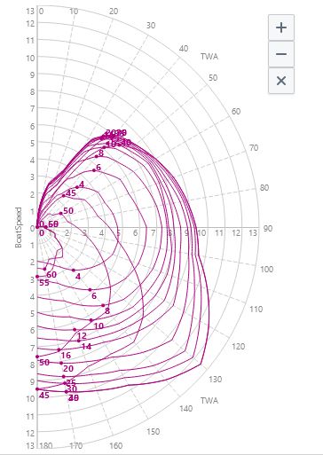
Once you understood the basics, you can go further: doing selection, handling zoom, smoothing lines… Sky is the limit !
For instance, we can create polar charts with the following code:
function createPolarChart(data) {
  // Split the data into rows
  const rows = data.trim().split("\n");

  // Extract the header row (TWA\TWS and the rest of the column labels)
  const header = rows.shift().split("\t");

  // Prepare the labels for the TWS values
  const twsLabels = header.slice(1);

  // Prepare arrays to store TWS values and TWA data
  const twaValues = [];
  const twsData = [];
  const twaData = [];

  // Process the remaining rows
  // ROW == TWA value for TWS
  rows.forEach((row) => {
    const rowData = row.split("\t");
    const twaValue = parseFloat(rowData[0]);
    v twsDataRow = rowData.slice(1).map(parseFloat);

    // Store the TWS value and TWA data
    twaValues.push(twaValue);
    twsData.push(twsDataRow);
    //console.log(twaValue);
  });
  // create TWS col
  // col = speed value for TWA at a TWS
  /// Add traces for each TWS value
  twsLabels.forEach((twsLabel, index) => {
    // we got the idx of the TWS needed.
    // build the array of twa
    const twatws = [];
    twsData.forEach((currentElement, idx) => {
      twatws[idx] = currentElement[index];
    });

    twaData.push(twatws);
  });
}

function drawPolarDiag() {
  //TODO: get from HTML
  const width = 960,
    height = 500,
    radius = Math.min(width, height) / 2 - 30;

  const angle = d3
    .scaleLinear()
    .domain([0, 360]) // TODO:scale twa
    .range([0, 2 * Math.PI]);

  const r = d3
    .scaleLinear()
    .domain([0, 60]) // TODO:tws
    .range([0, radius]);

  // Create the SVG element
  const svg = d3
    .select("body")
    .append("svg")
    .attr("width", width)
    .attr("height", height)
    .append("g")
    .attr("transform", `translate(${width / 2},${height / 2})`);

  // angle axis
  const ga = svg
    .append("g")
    .attr("class", "a axis")
    .selectAll("g")
    .data(d3.range(-90, 270, 45))
    .enter()
    .append("g")
    .attr("transform", d => `rotate(${d})`);

  ga.append("line").attr("x2", radius);

  ga.append("text")
    .attr("x", radius + 6)
    .attr("dy", ".35em")
    .style("text-anchor", d => d < 270 && d > 90 ? "end" : null)
    .attr("transform", d => d < 270 && d > 90 ? `rotate(${180 + radius + 6}, 0)` : null)
    .text(d => d + "°");

  // radius axis
  const max = 10;
  const gr = svg
    .append("g")
    .attr("class", "r axis")
    .selectAll("g")
    .data(r.ticks(max).slice(1))
    .enter()
    .append("g");

  gr.append("circle").attr("r", r);

  gr.append("text")
    .attr("y", d => -r(d) - 4)
    .attr("transform", "rotate(20)")
    .style("text-anchor", "middle")
    .text(d => d)

  // draw data
  const color = d3.scale.category20();

  const line = d3.svg.line
    .radial()
    .angle(d => angle(d[0]))
    .radius(d => r(d[1]));

  svg
    .selectAll("point")
    .data(data)
    .enter()
    .append("circle")
    .attr("class", "point")
    .attr("transform", function (d) {
      const coords = line([d]).slice(1).slice(0, -1);
      return "translate(" + coords + ")";
    })
    .attr("r", 8)
    .attr("fill", (d, i) => color(i));
}
Which will render things like that :
Why use D3.js?
When considering the relative complexity of D3.js’s use, you might wonder why use it instead of more straightforward tools like chart.js or highcharts ? I think there is two key differences:
- Simpler libraries are quicker to setup a graph, but these graphs are more standardized and harder to customize.
- On the other hand, D3.js may look like more work, but as its name suggests, your rendering is more Data Oriented, giving you a more customizable representation** of your data.
So if you consider D3.js as a toolbox, much more customization is possible compared to other solutions.
Links
- The library: D3.js
- Mike Bostock’s website : the creator of D3, which has lots of samples and tips.
- C3.js : a wrapper around D3.js