The Power of infographics - Why have I been designing infographics since 2012?
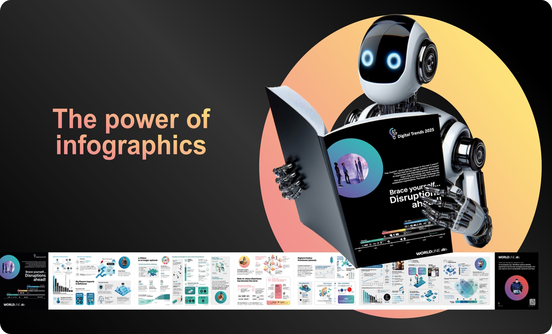
In the age of information overload, communicating complex ideas effectively requires not only clarity but also creativity. Infographics can transform the mundane into the captivating, ensuring a message isn’t just received but understood and remembered. Within various domains such as visions, trends, return of experiences, tech explorations, and/or data analysis, infographics are more than simple visual aids; they are extraordinary tools to convince and explain. That’s why designing infographics adds immense value and interest when it comes to communication in these areas? At the end of this article, you will find all the infographics links ^^
Storytelling through Experiences
Post-project retrospectives or ‘return of experiences’ (REX) are valuable for learning. Infographics can encapsulate these experiences in a relatable storytelling format. Whether it’s a success story or a cautionary tale, an infographic can highlight key learnings, outcomes, and actions in a narrative arc that resonates with the viewer, encouraging engagement and reflection.
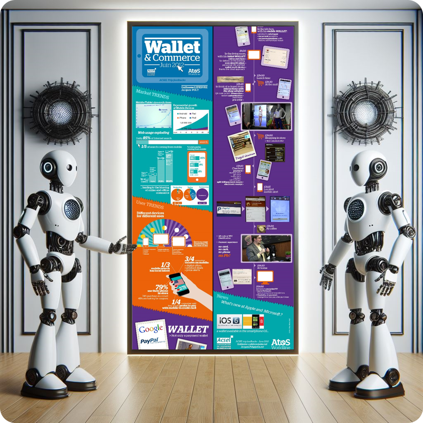
In 2012, I designed my very first infographic to share our learning expedition with #ACSEL association and to zoom on Wallet and commerce trend… I was thrilled by the reactions and feedback I got. This is how I figured the power of infographics.
Mapping Trends with Clarity
Market trends, techs, and societal shifts often involve an amalgamation of data sources, statistics, and forecasts. Infographics serve as the perfect medium to tastefully aggregate and display these aspects in a manner that highlights the most crucial points. They can depict changes over time, correlate different pieces of data, identify patterns that might be elusive in text-heavy reports, and add complementary storytelling thus adding value to strategic planning and decision-making.
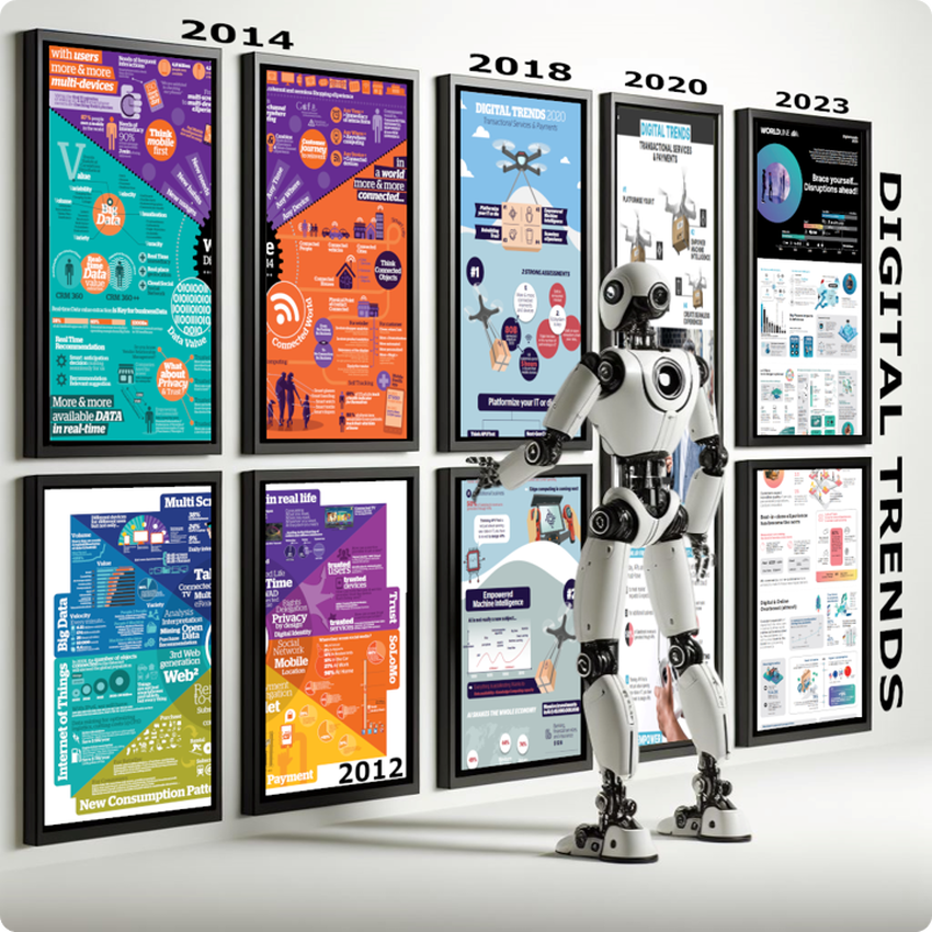
Between 2012 and 2023, based on #WorldlineLABS works and watches, with some colleagues (thank you Jacques Poly , Bruno Le Ven , Vianney Dhalluin , Julien Decoster , Julien Rogeau , Colombe Hérault , Jean-Baptiste Drucker , Charlotte Pasqual , Frédéric Vieren ), we designed several Digital trends infographics to combine figures and remarkable facts to tell stories with our customers and identify areas for technological co-innovation. At the end of this article, I’ll share with you how we made these Digital Trends infographics.
Simplifying Complex Visions
It’s really not easy to present and demystify a new domain as they usually are full of tech and business impacts and have lots of existing but contradictory definitions. In addition to that, they are so much forward-looking that it becomes abstract to the listener. Infographics distill these definitions into digestible and memorable visuals that align teams and stakeholders. By illustrating the perimeter and potential transformations, infographics transform the abstract into tangible concepts, facilitating a shared understanding and commitment to a unified direction.
In 2017 and 2018, with Cyril Cauchois , Charlotte Pasqual , Frédéric Oble and Eric Monchanin , we designed 2 linked infographics: first about Bots and virtual assistants, and the second about Artificial Intelligence that allow machine to accomplish task humans execute with intelligence.
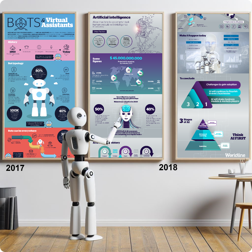
If you jump inside the 2018 AI infographic , you will discover how we defined 5 dated AI steps in 2018, and I’m really pleased when I reread the step 5. We didn’t predict that GenAI would explode at the end of 2022, but we did indicate the direction it could take after 2022: AI will contribute and exchange. Sounds familiar 😉, isn’t it?

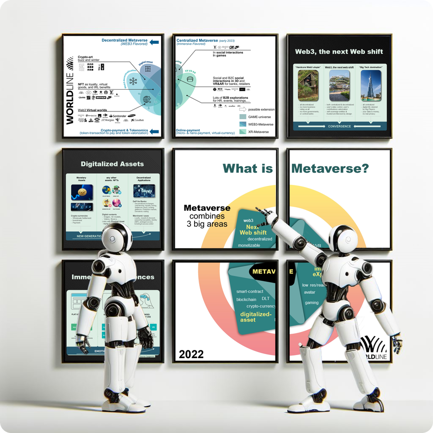
In 2022, with Frédéric Vieren , Johan Maes and Yacine Kessaci , I designed 2 infographics to explain and demystify Metaverse & web3 buzzword. In this case, the infographics allow to define the concepts and highlight their fundamental differences. Metaverse could be defined as the evolution of the Internet on 3 big area crossroads: Immersive- and XR-Xperience (with and without VR-headsets), the Next Web Shift with a more decentralized approach (connected with crypto-wallets) and digitalized-asset (based or not on blockchain and new DLT); and the Web3 as the future of Internet based on decentralized web, evolution of Internet governance, and a big change concerning the ownership and the control of data and assets.
Exploring the Tech Frontier
As technology evolves, so do the complexities of its applications and implications. Infographics have the power to break down tech explorations into more approachable visual summaries. Whether it’s introducing a new software tool, outlining the framework of a complex system, or visualizing the impact of emerging technologies, infographics demystify the technical jargon and make the content accessible to a broader audience.
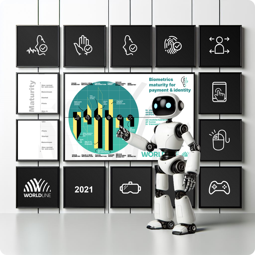
In 2021, based of #WorldlineLABS works on lots of biometry techs (thank you Wael Elloumi , Cyril Cauchois , Pierrick Lefevre , Jean-Baptiste Drucker , Frédéric Vieren , Li Guo , I designed an infographic to show the tech maturity level depending the use-cases and the biometric modalities. This infographic has been useful to make the links and to introduce all biometric modalities which concern new payment experiences and solutions:
- fingerprint for new generation of payment card,
- facial and palm biometry to have touch-less in-store payment Xperience, but also to manage all biometrics in mobile app (without mobile OS delegation),
- voice biometric for mobile apps, web, phone calls, and social messaging (like for WhatsApp strong authentication in a chat conversation),
- and behavioral biometry for mobile and web apps, for game consoles, and VR/XR experience… To allow to have a silent, invisible, zero-effort strong authentication (even before you want to buy and to pay something!)
Analytical Insights Brought to Life
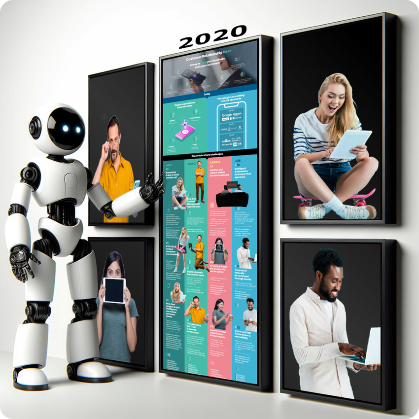
Data and Use-Case analysis can uncover a wealth of insights, yet presenting this data in a compelling way is challenging. Through the use of infographics, analysts can move beyond spreadsheets and charts, breathing life into data points by telling a visual story. By highlighting correlations, patterns, and key metrics in a visually engaging format, infographics not only captivate the viewers but also aid in retaining important information. In the case of Use-case analysis, it could be also useful to work with Design Personas, it was that we used with Angelique Oger and Nicolas Marcoin to describe, in 2020, the revolution of the Customer Relationship including new channels of interactions, new techs impacts like AI, and also new customers habits!
What about the conception and the visual design of infographics?
The conception of an infographic can take time. In previous examples, Digital Trends infographics were the most complex ones to design and took time to publish. Here are some key tasks that we did to create the infographic:
- we had to identify as many surprising figures and information as possible to illustrate our digital trends,
- we choose the 3 or 4 main chapters of the story + we define/wrote also the links between the chapters,
- for each chapter, we choose the most surprising facts which helped the story: as you know “to chose is to forsake”, it’s always difficult but it’s essential, it’s impossible to visually put all figures and messages on only one infographic,
- we also had to write the introduction and the conclusion of our story,
- we had to define the style of the infographic, but also the target of the publication (web, social, and/or print) to be able to validate the format of our infographic (vertical, horizontal, square, 16:9,…),
- and only after doing all the above points, we were able to start working on the visuals! And to produce this visuals, the full story must be shared and understood by the graphic designers: for each synthetic message, we often had to explain it with additional concrete examples!
I let you imagine the number of proof readings, corrections and adaptations required ^^.
Concerning the visuals and the drawing, for those of you who know me, I still don’t know how to draw or choose the right colors… And it’s as important to have a real story between the figures and the information in an infographics as it’s to to have visuals that carry the story and give it meaning! So a big thank you to #WorldlineCommunication and #Worldline+Agency team, especially Maud Gallet , Julien Mase , and Isabelle Dalle for the quality and the meaning of the visual design of lots of these infographics!
All the infographics links
You will be able to see the evolutions concerning the design and the conception, but you will always see storytelling ^^

