Naming colors: overcoming your 50 shades of gray
 Simon Mercier
- 5 Min To Read
- 31 Oct, 2023
Naming colors correctly in my code has always been a headache. I was familiar with two schools of thought:
Name the color based on itself
(red, blue, green), generally with a vague, sophisticated variation(indian_red, tea_green, royal_blue).Name the color according to its intended use, often far too specific to be useful
(home_dropdown_color, settings_title_color).
I used either approach, depending on the project, but was never fully convinced of their effectiveness. Then one day, a colleague (whom we’ll call Mickael) showed me Google’s Material Design 3 kit on Figma .
My reaction, of course, was …

Yes, this Figma kit contains no fewer than 690 color variables.
But over time, I realized that by adopting Google’s naming logic and adapting it to my own needs, I could create a relevant and scalable naming system for each of my projects without having to manage as many colors.
That’s what I’ll explain today.
Why color or use-based naming doesn’t work
1. 50 shades of gray
At this point, you may feel like you’ve been clickbaited but don’t panic, this is the moment.
I’ve often been in the situation where I start a project and there are three shades of gray in the color palette so I name them as follows:
light_grey: #f0f0f0;
grey: #b4b4b4;
dark_grey: #6f6f6f;
A few months/years later, new colors appear in the color palette for a new feature. Two new grays!
very_light_grey: #f8f8f8;
light_grey: #f0f0f0;
grey: #b4b4b4;
dark_grey: #6f6f6f;
very_dark_grey: #454545;
And after a few iterations, we end up with something like this:
very_very_light_grey: #f8f8f8;
very_light_grey: #f8f8f8;
light_grey: #f0f0f0;
grey: #b4b4b4;
grey_dark_but_not_so_much: #ababab;
dark_grey: #6f6f6f;
very_dark_grey: #454545;
darkest_grey_i_have_ever_seen: #282828;
Bonus points if they are no longer sorted by order of brightness after a while!
2. Dark theme
Another less obvious point is that this color based naming is not suitable for light/dark theme variations of an application.
The goal when creating a dark theme is to have a single link between the light and dark colors:
Color 1
Light: #FFFFFF
Dark: #000000
Color 2
Light: #2D8282
Dark: #579B9B
Let’s take an example. Here, we have color naming. The text in the frame at the top of the screen and the cell surfaces are linked to the same color white.

Now, let’s switch this screen to dark theme. Cell surfaces will now be in a shade of gray/black. The text in the frame at the top of the screen will remain white:

So, we reached the limits of our color naming:
white
Light: #FFFFFF
Dark: #FFFFFF or #252726

An easy fix would be to name the colors based on the their particular usage:
dashboard_accounts_surfaces
Light: #FFFFFF
Dark: #252726
dashboard_header_text
Light: #FFFFFF
Dark: #FFFFFF
Yes, this would solve the problem for this particular case. But we end up with names so specific that we can never reuse these colors on another screen.
We therefore lose all the interest in using variables for colors; it would be just as effective and simple to duplicate hex codes everywhere in the code.
Material design to the rescue
Our goal is not to copy Material’s naming system precisely, nor to automatically generate a color palette using Material Theme Builder (which is an interesting tool but not the topic of this article).
Our goal is to understand the general philosophy of this naming system and then adapt it to our needs.
Here’s how Material suggests breaking down our main colors:
](https://blog.worldline.tech/images/post/naming_colors_overcoming_your_50_shades_of_gray/material_colors.png "Source : [Material Design 3](https://m3.material.io/styles/color/the-color-system/key-colors-tones)")
For Primary Key Color, Material tells us:
Primary is the base color
OnPrimary is applied to content (icons, text, etc.) that sits on top of
primaryPrimaryContainer is applied to elements needing less emphasis than
PrimaryOnPrimaryContainer is applied to content (icons, text, etc.) that sits on top of
PrimaryContainer
Let’s apply this to our previous example. We could get something like this:
](https://blog.worldline.tech/images/post/naming_colors_overcoming_your_50_shades_of_gray/palette.png "Source : [Material Design 3](https://m3.material.io/styles/color/the-color-system/key-colors-tones)")
And we could use it to create these two buttons:
](https://blog.worldline.tech/images/post/naming_colors_overcoming_your_50_shades_of_gray/buttons.png "Source : [Material Design 3](https://m3.material.io/styles/color/the-color-system/key-colors-tones)")
With this system, colors are named based on their role within the application.
Now that we have understood the general principle, we can continue to apply it to our other colors.
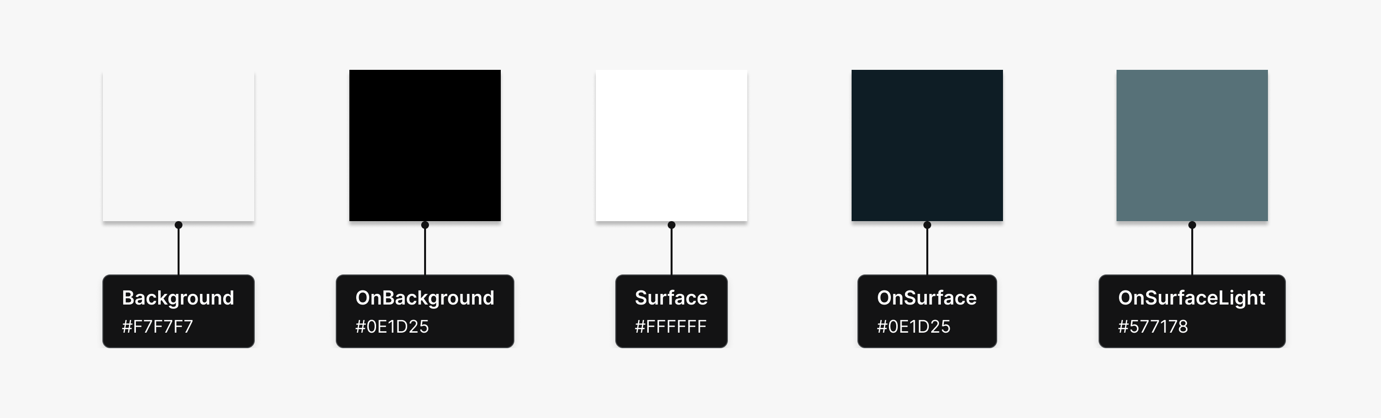
Background will be the background color of our screens.
Surface will be the background color for our cells, cards, etc.
](https://blog.worldline.tech/images/post/naming_colors_overcoming_your_50_shades_of_gray/surface_application.png "Source : [Material Design 3](https://m3.material.io/styles/color/the-color-system/key-colors-tones)")
NB1:
OnBackgroundandOnSurfacehave the same hex code, and that’s not a problem! They have different roles.NB2:
OnSurfaceLightdoes not exist in the Material color naming system; I invented it because I needed a lighter variant for writing on a Surface. And that’s the whole idea: create consistent color roles according to our needs.
And thanks to this naming, we can associate a different hex code for each color role, for both light and dark theme.

Conclusion
Where white will be too generic and dashboard_background_color will be too specific, role-based naming allows us to use the same color names across all of our screens while having a robust and evolving system.
The main advantages in my opinion are:
Significantly reduced risk of inconsistencies: designers can quickly understand the color palette and how it works. If an inconsistency happens, developers will be able to raise a warning before using OnPrimary on a Surface.
Obvious and easy-to-guess naming: a developer needs to add text on a Surface but doesn’t have a mock-up with the specified color name? He can guess that choosing OnSurface is a valid pick.
Dark mode ready: even if the application currently has only a light theme, little effort will be needed to create a correspondence table when we want to implement the dark theme (slight adjustments will be needed to decline some roles, but we will be able to do so without “breaking” the light theme).
We can also think of some pitfalls to avoid:
Find the right balance: even if it’s more difficult to stumble upon this issue with roles, it’s still possible to end up with a naming which is either too generic or too specific. When defining roles, it’s important to find the right balance between these 2 extremes.
Be careful when adding new colors: a new version of the app or website may require new color roles. In such cases, it’s important to carefully consider how these new color roles will be integrated with the existing ones to maintain a coherent whole.